

Redesign | Information Architecture | UX Design | A/B Testing | Prototyping
This is a website redesign for the Information Architecture course at the University of Baltimore.
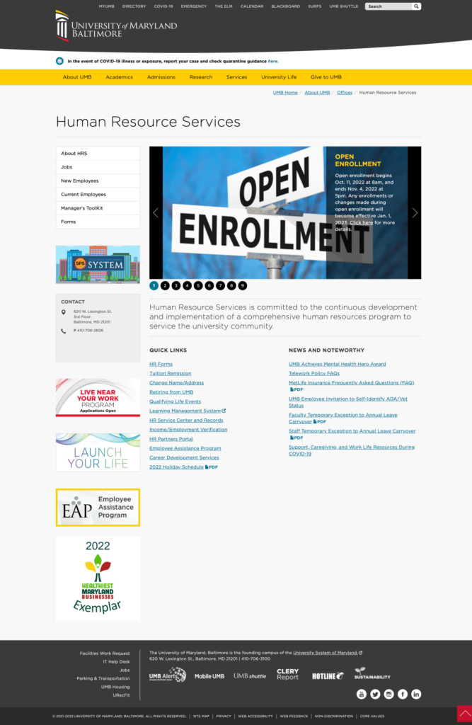
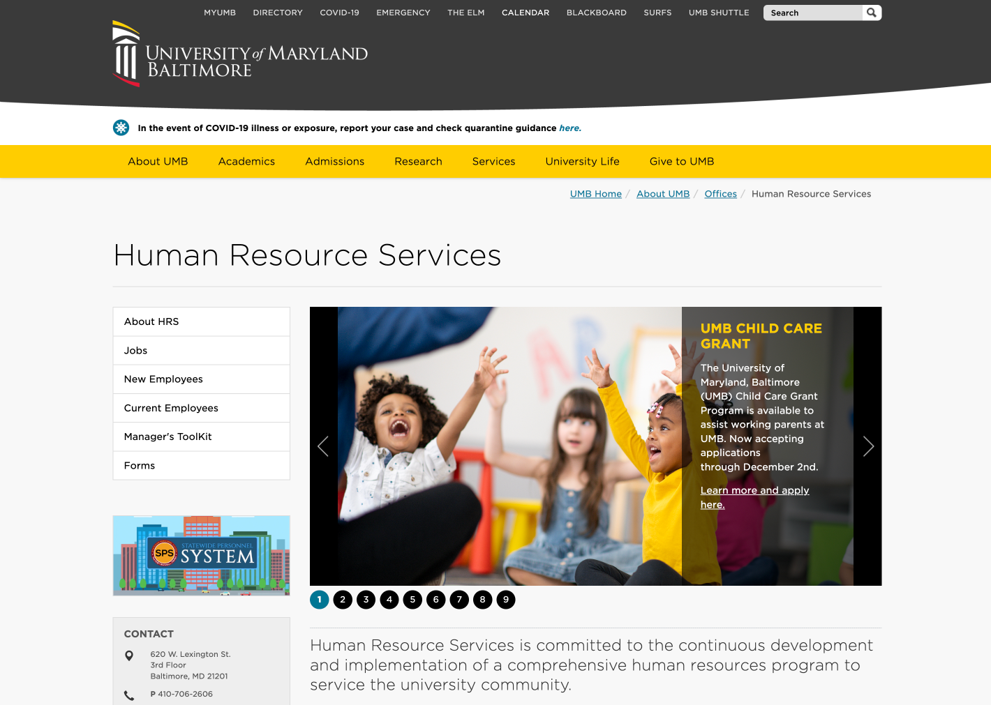
The University of Maryland, Baltimore (UMB) Human Resources Services website’s underlying goal is to provide a breadth of information and services to the user in a friendly and innovative way. Our team aimed to rebuild the information architecture and user flow for the UMB Human Resources Services website. The redesign needed to enhance the overall experience of the site. Aesthetically, the original site is a visual dumping ground which doesn’t do justice to its purpose. There is no structure to the content. It amplifies confusion rather than coherency.
Therefore the team needed to create a system that could logically represent a wide breadth of content the site shares such as information about employment, benefits, and other HR services. It was also important to come up with a modern and appealing visual style that will shine a light on UMB’s personality. Our ultimate objective is to make it easy to understand the provided information on the site and facilitate a positive user experience through informative and relevant content to navigate potential users in the right direction.
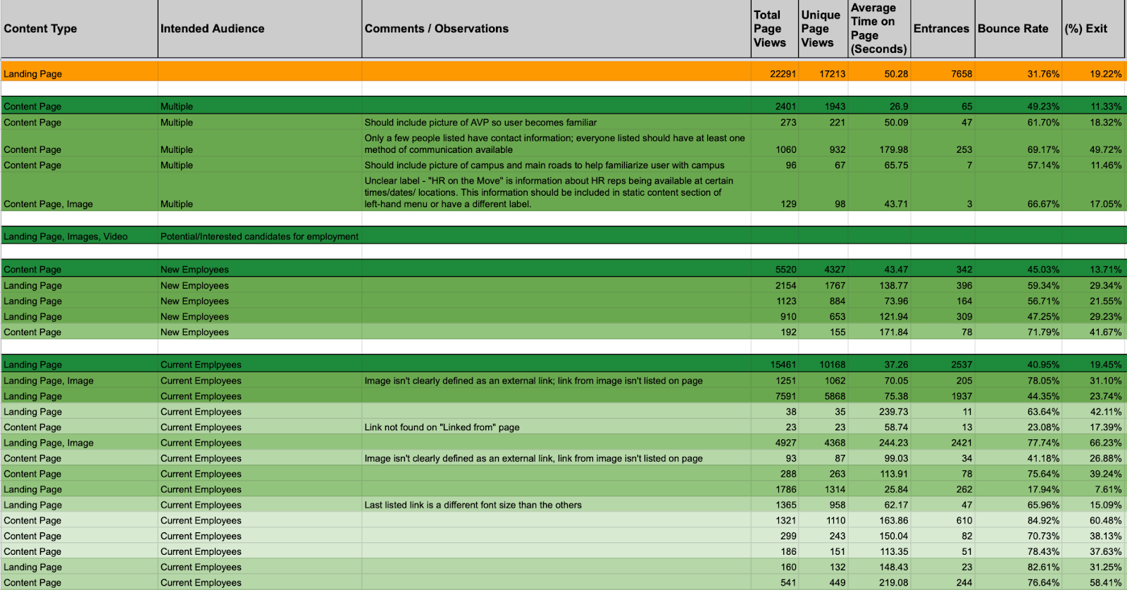
We started the whole redesign process of UMB Human Resources Information Architecture by cataloging all information assets as the website’s target audience mainly visits this page to access specific content.

We created a total of seven personas to:
- Build empathy and understanding of the current or ideal target audience of the UMB Human Resources page we are designing for
- Identify users’ goals, needs, challenges, and frustrations
- Make the website more desirable, useful, and valuable
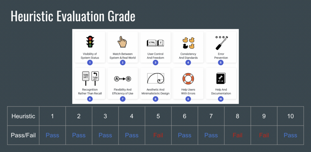
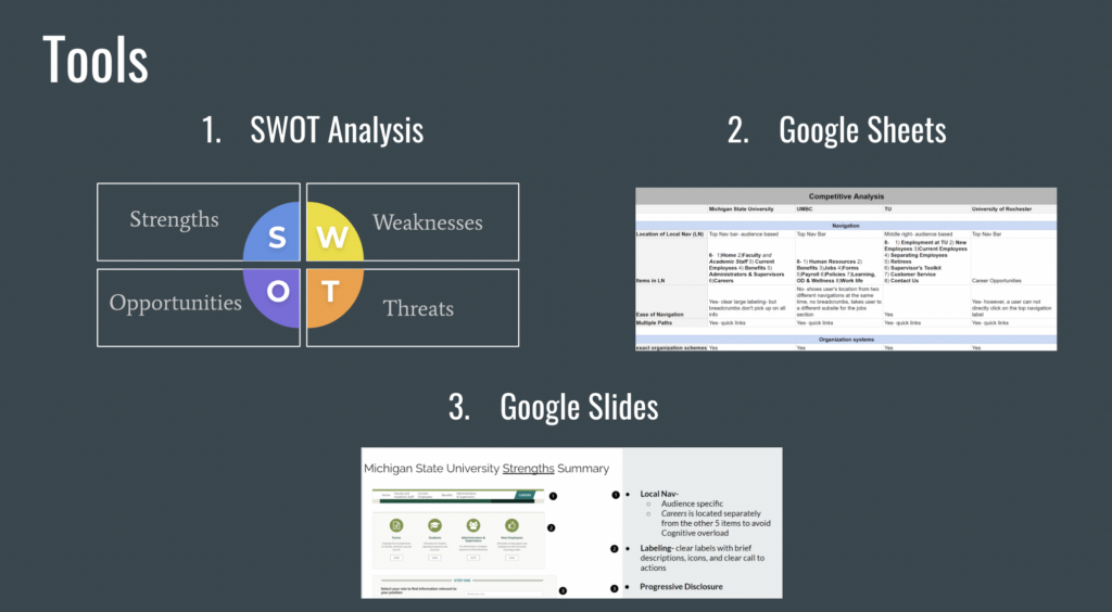
We also completed a heuristic evaluation and a competitive analysis.
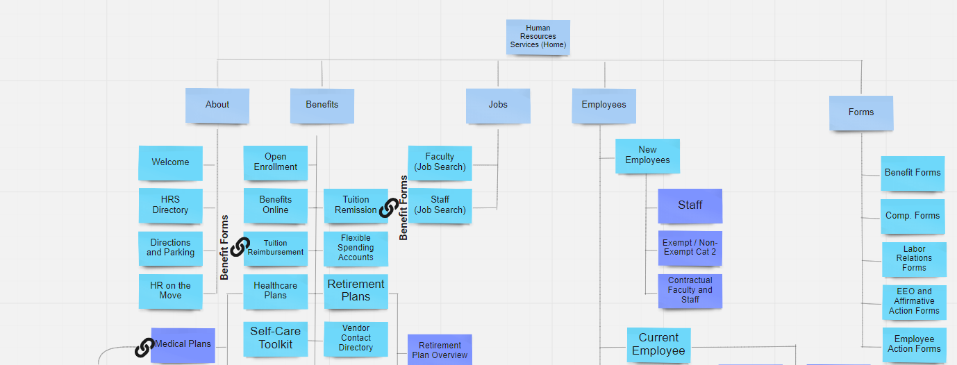
We redesigned the existing sitemap to make it easier to identify patterns of information storage and quickly see how many levels deep certain information was contained.
For the UMB HR redesign, a hybrid card sort was conducted. A hybrid card sort presents users with existing categories and allows them to create new categories. This form of card sorting was chosen over other forms to provide insight into other potential category labels that users may want to use, as well as determine if users can properly place items into the correct categories.
This card sort was conducted using optimal sort, which is an online card sorting tool. There were a total of 17 participants who completed the sort. These participants had varying occupations, education levels, and technological preferences. The average completion time for the sort was eleven and a half minutes.
Following the creation of our team’s sitemap, we then began our redesign of the UMB Human Resources Services page using Miro. Miro is an online whiteboard that can be used to visualize ideas, as well as work on projects either individually or with a team.

To begin this process, our team first discussed how we would display content and where the content flowed best in comparison to the original UMB HRS website. We collaborated in unison and in real time so that we could execute our vision and make annotations. We kept specific design details out and focused more on the skeleton of the page.

One of our major priorities was to have less clutter and have the most important content readily available to avoid having to scour through the website. We decided to use icons as a visual aid to provide more clarity as to the content the user would be viewing. Most significantly, we have a contact and FAQ section at the bottom of each page so that the user can immediately find help. These new wireframes were used to illustrate the initial page designs that we hoped would show the pieces of content we deemed to be most valuable, showed hierarchical preference, and were most important to users.
We also discussed meeting user needs for those who use mobile. We wanted to make sure that the mobile layout matched the skeleton of the desktop version. We wanted to have sufficient white space, avoid clutter, and have the most important information available at the top of the screen.
You can view the full Google Slideshow presentation here.
")


